Research Example: The "Stage" Method

Background
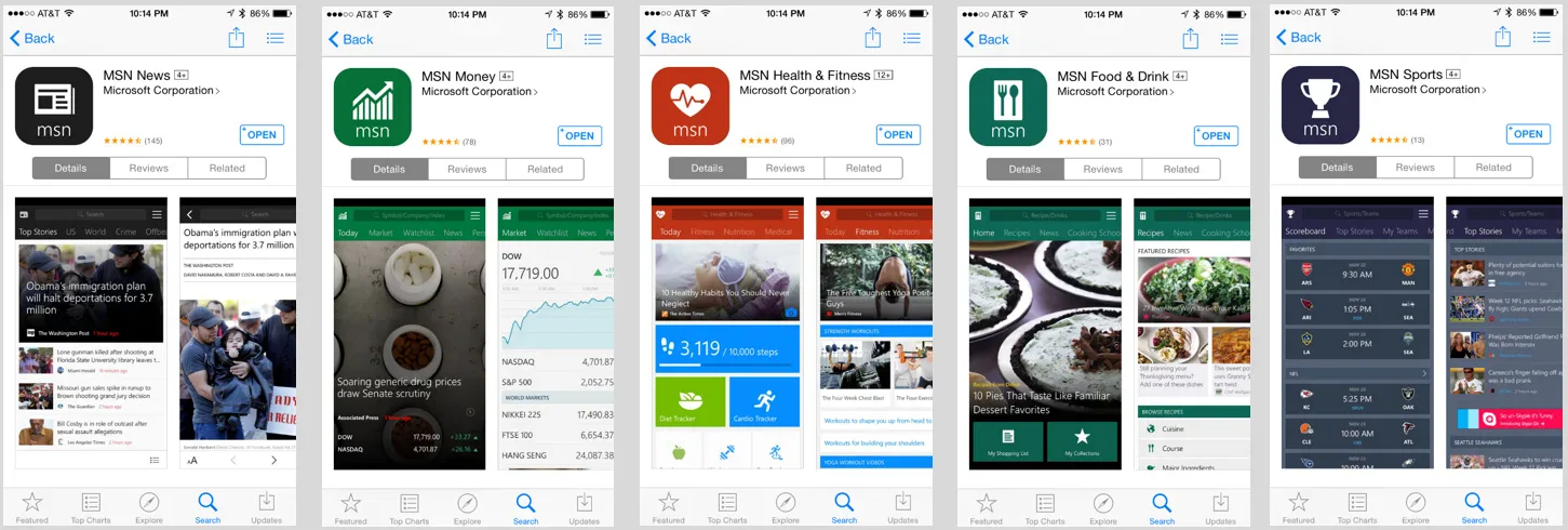
At Microsoft on the Information and Content Experiences Team, though I normally worked with designers and sometimes PMs and engineers, this research request actually came from our VP! I worked primarily with him to determine what the research questions would be. We had already built a series of apps on Windows 8 and on Windows Phone - News, Weather, Sports, Travel, Money, Health & Fitness, and Food & Drink. On those platforms, they had the advantage of being preinstalled. But we had started porting them to iOS and Android where they would not have that advantage and would need to compete with other apps in their respective categories already in the app stores. The VP wanted some insight into which apps were worth investing resources in, and if there were any that might not be competitive enough to gain traction.
Note: Nondisclosure Agreements are serious business. All in-development product images and other artifacts from my research are confidential to Microsoft. I will not be sharing real raw data, real examples of reports, or images of content or features that did not ship in some form.
Example Research Questions
- Which of our current apps will be competitive on iOS and Android?
- Are there any apps that we should consider not shipping on those platforms?
- What do users like and dislike about the apps? What features are missing that could help them be more competitive?
But there was a problem
There were seven app categories: News, Weather, Sports, Travel, Money, Health & Fitness, and Food & Drink
. . . On two platforms: iOS and Android
. . . Formatted for two device types: Phone and Tablet.
There were 28 app experiences to evaluate. But the VP wanted answers within a few weeks!
There was also a solution
I sat down with my manager and we put our heads together to figure out what was feasible. Together we came up with a plan that would work with our constraints.
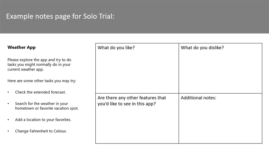
On a previous team I had run “playtests” on games, which involved having multiple users simultaneously evaluate a product, where each one has their own copy of the product and provides handwritten or electronic survey feedback while they try it. It’s an individual evaluation, and participants are discouraged from peeking in at their neighbors’ experiences or survey answers. It’s a great way to collect a larger sample of data more quickly than a typical usability test, so I thought we should start there. One question I would also ask each participant would be to compare our app with the app they currently use, rate how likely they would be to replace their current app with this one, and describe why or why not. Then we decided some healthy group discussion afterward would be helpful as well, so the end of a session would include a focus group.
I came up with a handy acronym - STAGE. Solo Trial and Group Evaluation. Each participant in the group would try the app on their own demo device while completing a brief paper survey about the experience (solo, to prevent groupthink from interfering with their individual feedback) and then the group would come together and inspire greater depth of conversation through sharing ideas and perspectives.
With so little time I’d need to consolidate my efforts as much as possible. I wanted news app users to evaluate the News app, and finance app users to evaluate the Money app, et cetera, so each app category needed its own set of users. And the iOS app experience was different from the Android experience and also had a different user base. But for each app type on each OS, having one group of users evaluate both the phone and tablet app seemed reasonable. So for example, a group of iPhone owners who used weather apps would evaluate both the phone and tablet Weather app, Android owners who used recipe apps would evaluate Food & Drink on both phone and tablet, and so on. That cut the potential number of user groups in half to 14 - 7 on iOS and 7 on Android.
Outcome
With 2-hour sessions for each group, I was able to collect the data for all of our apps in six days, using a total of 85 participants.
As a result, I was able to gauge the overall experience for each app and how they compare to the apps users already love, and summarized these findings for the VP. My findings suggested that two apps would have the most trouble competing on non-Microsoft platforms without having that preinstallation advantage - Weather and Travel. For Weather, although participants described the app as easy to use and liked the design, ultimately they were already happy with their current weather apps, most commonly those that were preinstalled on their devices, and ours didn’t add enough additional or new value to be worth the effort of downloading a new app. Travel just wasn’t quite ready to compete with the likes of long-established giants like Kayak and TripAdvisor unless it had more robust booking functionality…maybe it just needed some more time. The VP had the information he needed to re-prioritize things going forward. And ultimately, on both iOS and Android, the apps that shipped – the ones we were most confident would succeed – all had an average rating between 4 and 5 stars within the first year in their app stores.


It wasn’t perfect, but it worked
Time constraints were tough, and budget constraints also limited the total number of participants.
Eight participants had been recruited for each group, but a few groups had lower show rates, closer to four or five total. That’s a pretty small sample to potentially help determine the fate of an app. Ideally samples would have been larger, or with more time, those who didn’t show up could have been backfilled to have a full set of participants on every app experience.
Fortunately, my team had been conducting research on all of these apps for a long time. With a lot of historical data to reference and compare against, I could see that the findings in the STAGE study were overall consistent with expectations, increasing confidence in the results.
If we had more time and technical resources to support the request, I might have liked to do something like a beta program instead, where more users could have access to the apps on their own devices for a few weeks, providing a larger sample size for feedback and more natural app usage.