HBO Max
The latest version of HBO and WarnerMedia’s on-demand video streaming service
Released: May 27, 2020
Role: Senior User Researcher
Where: HBO
When: 2019
Contributions: UX benchmark research for the HBO Now experience, Usability evaluation of the HBO Max navigation model
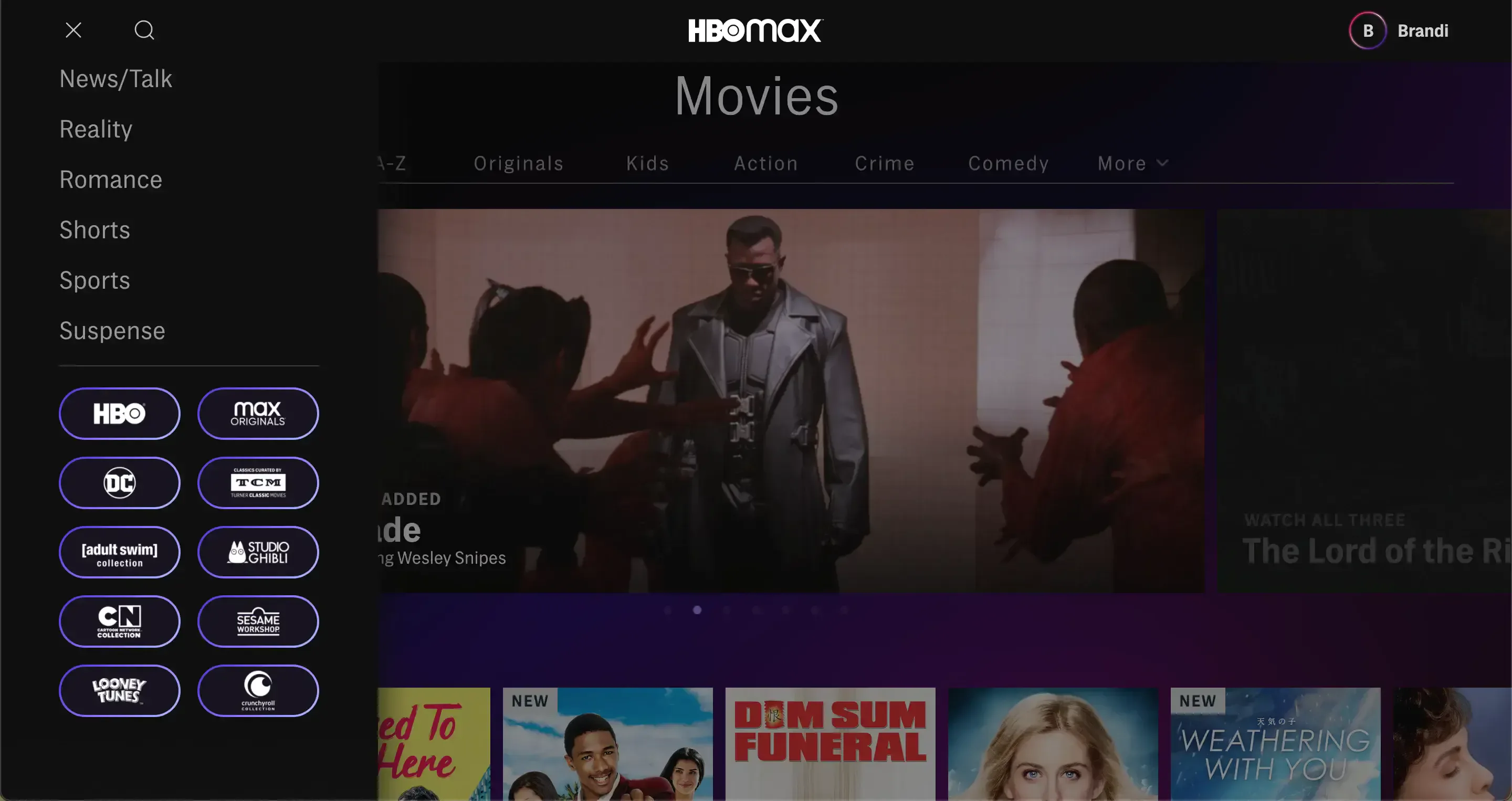
I worked as a consultant UX Researcher for HBO throughout the transition from HBO Now/Go (the streaming apps which contained on-demand content only from HBO) to WarnerMedia’s new HBO Max, which despite sticking to the HBO brand, contains a much larger variety of content across several other networks such as Turner Classic Movies, DC, Cartoon Network, Studio Ghibli, Adult Swim and others. In order to pivot quickly and get this new product going, it was decided early on that the new streaming app would be built off of HBO’s basic platform but expanded to accommodate this wider array of offerings.
Much of my research work involved helping the team understand how users navigate these types of video content when browsing for content and then ensuring the new app accommodated users’ mental models. From previous research on HBO Now and Go, our team already understood that the most common ways people search for content within HBO are by content type or by genre, or often a combination of the two. For example:
Content Type (i.e., movies versus series): “I want to start a new show to watch every day or every week for a while, or I have a whole weekend and want to binge a whole series” versus “I want to have a movie night with friends”
Genre: “I had a bad day and want to watch something light and funny to cheer me up” or “I’m a big horror fan”
Both: “I’d like to find a new drama series to watch in the evenings” or “I want to find a movie that will entertain the kids for a while”
So HBO Max would need to accommodate people’s need to browse by any combination of content type and genre. But in addition, Max would layer in a variety of new networks that each had their own audiences and fandoms. Your average HBO watcher might not be the same as your average Looney Tunes watcher, of course. People would need to be able to identify and navigate to those familiar brands quickly.
I conducted a series of research throughout this transition to ensure these basic navigation needs were being met. First, I conducted UX benchmark research to evaluate how well HBO Now was able to meet those needs and in what ways it fell short, since that was the basic structure on which Max would be built. While HBO Now was most of the way there, it generally lacked the flexibility to filter down to specific content by any combination of type and genre, or at best was inconsistent in how those paths were applied throughout the app.
Next, I took these learnings of our then-current product’s strengths and weaknesses and participated in a design sprint with the designers and PMs to lay out an early framework for the new navigation model for HBO Max, also including that additional layer of brand hubs for the new networks.
After the sprint, once the designers had created mockups that represented all basic page types and functions (home page, navigation menu, a movies, series, and genre page with all the subnavigation, brand hubs, etc.) I pulled everything together into a basic interactive prototype using Invision and conducted a usability evaluation nearly identical to the original HBO Now UX benchmark, plus some added tasks to account for the new networks, to ensure users were able to find all of the different content available in the app and quickly discover something they are in the mood to watch.
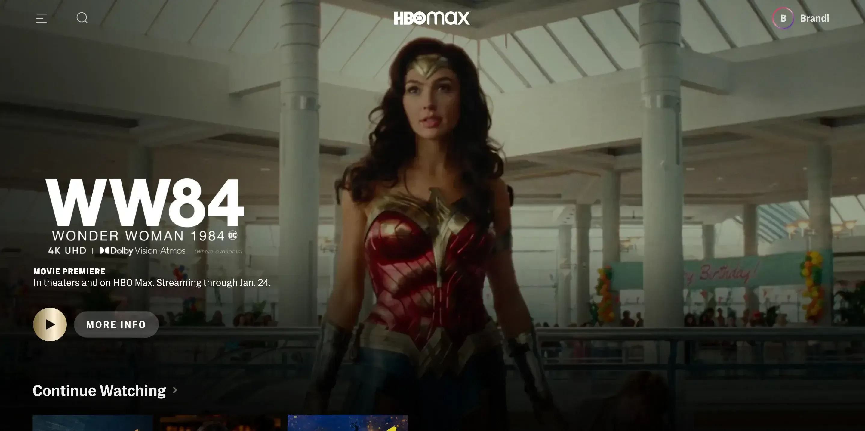
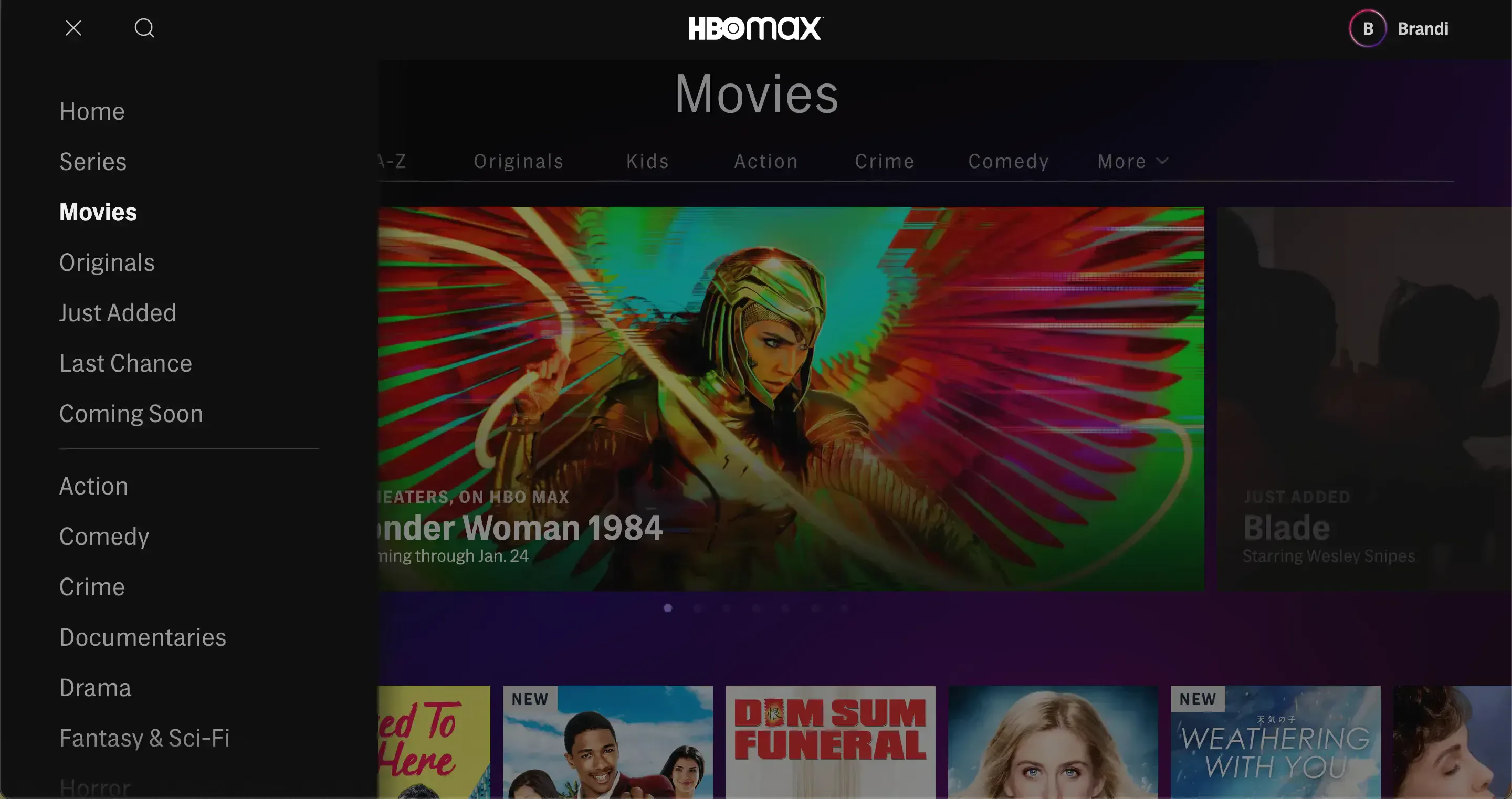
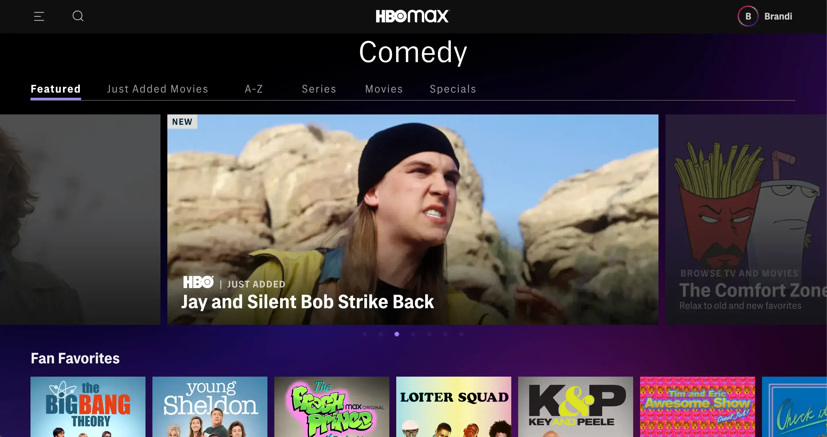
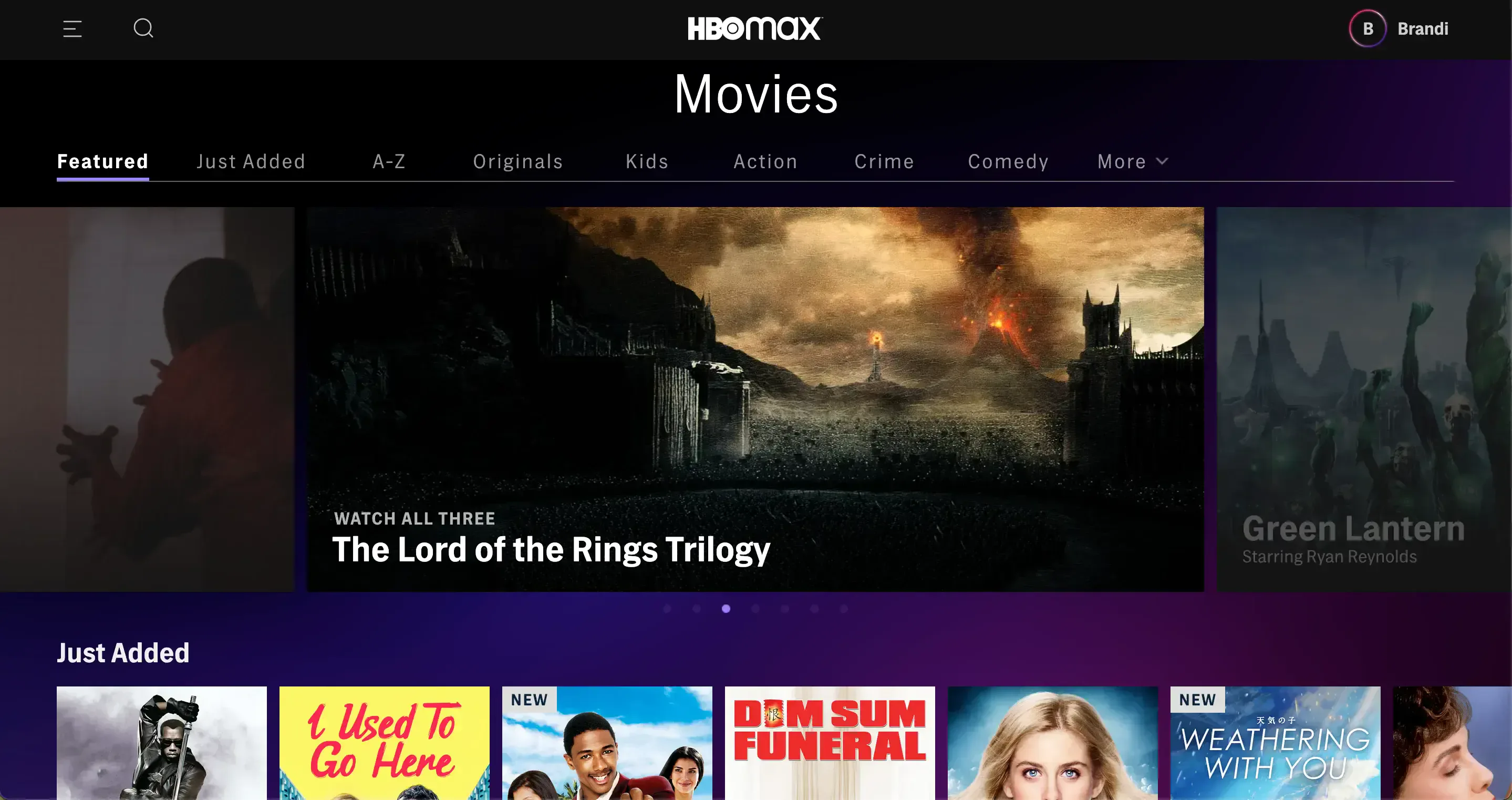
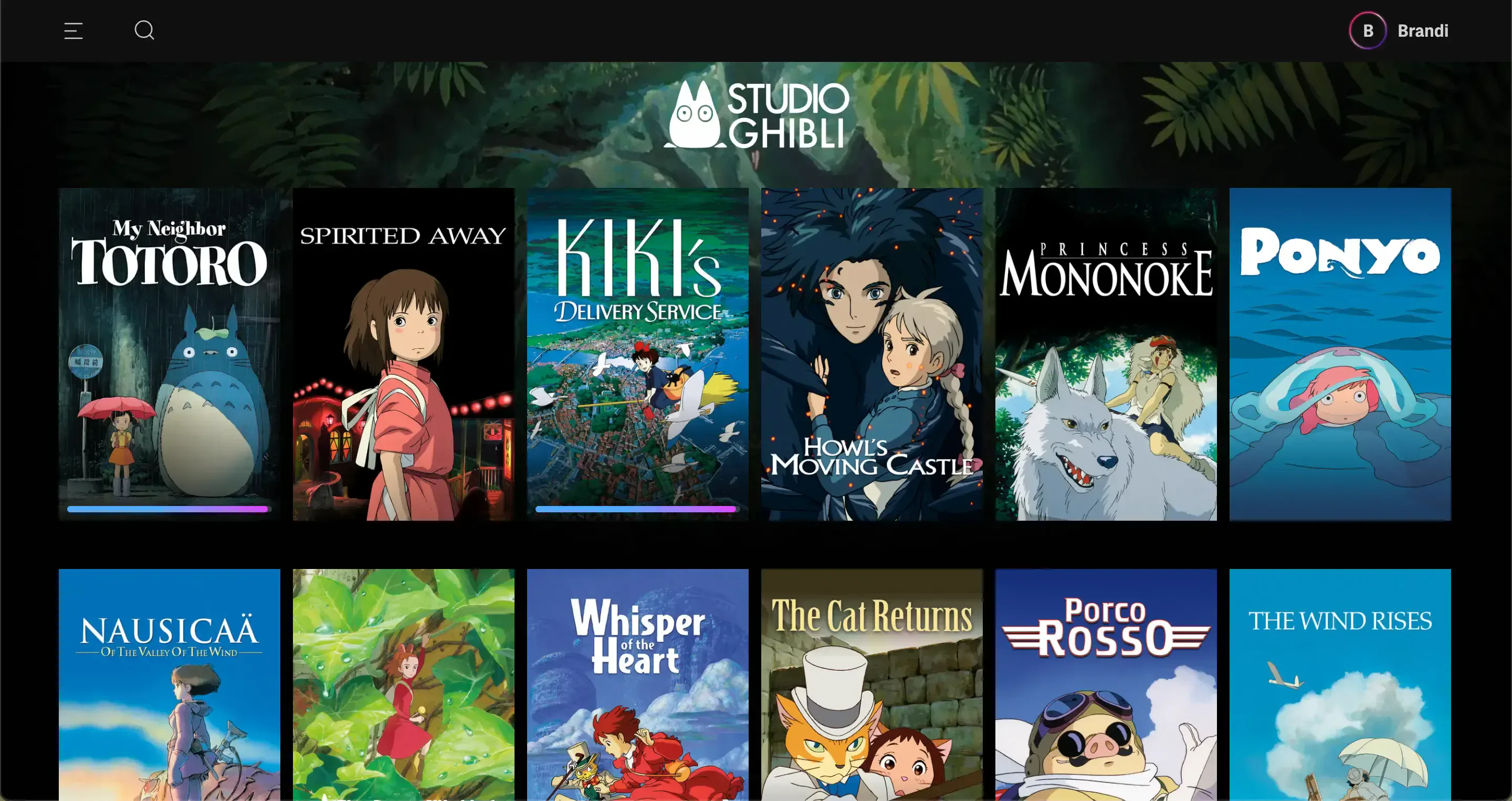
HBO Max allows users to browse by content type like movies or series, by genres, or to narrow down further by utilizing both in any order (e.g., by movies then by comedy, or drama and then by series). It also allows users to jump straight to all content from a single network, such as the long-awaited on-demand selection from Studio Ghibli. The interactions across different device types may be somewhat different if you’re using the Apple TV app with a remote or the web browser with a mouse or tapping with your phone, but the basic content navigation structure is the same everywhere you go.