Research Example: Usability Study
Background
This project was a collaborative effort between the Microsoft Band hardware team and the Apps team I was on. A subset of our Design team and one Researcher temporarily joined the Band project. After being the primary UX Researcher on the MSN Health & Fitness app, it was natural that they’d pick me to be their researcher. The Band hardware itself was already pretty far along in development when I came along and originally the plan was that I’d only be the researcher for the companion app, but when I realized they didn’t have a researcher evaluating the hardware, I jumped in to lead UX research for the whole project. The way I saw it, the Band and its app were not really two separate products, but part of one connected experience, and they should be evaluated as such!
The following is an example of a usability study on the Microsoft Band experience. I have done many usability studies on many products, but this example has kind of a fun story in it.
Note: Nondisclosure Agreements are serious business. All in-development product images and other artifacts from my research are confidential to Microsoft. I will not be sharing real raw data, real examples of reports, or examples of impact that include content or features that did not ultimately ship in some form.
Example Research Questions
- Can users set up the device and app via the FRE (first run experience)?
- Do users understand what the tile icons mean?
- Can users track their fitness activities (e.g., a run or a workout)?
- Using the app, can users customize which tiles appear on the Band, and in what order?
- Can users adjust which notifications they want to appear on the Band?
- Can users read and understand the stats and graphs of recorded fitness data?
I needed to evaluate if users understood how to perform expected tasks in the product. Usability studies are typically a good way to do this, as they allow the researcher to observe the users’ behavior directly and probe deeper when interesting things happen.
Example User Tasks
- Using the app, set up the Band for the first time.
- On the Band, check to see where your next calendar appointment is located.
- Imagine you’re going for a run. Use the Band to track your run, and jog around the room for a short time.
- Using the app, move the Calendar tile so that it appears first on the Band.
- Using the app, turn off email and text message notifications on the Band.
- Check if you burned more calories this week than you did last week.
Let's dive into one task
Imagine you’re going for a run. Use the Band to track your run, and jog around the room for a short time.
Expectation (design intent):
- User selects “Run” icon on Band.
- Screen says “Start a run.”
- User presses Action Button to start tracking.
- User presses Action Button again to end tracking.
Reality (user behavior):
- User selects “Run” icon on Band.
- Screen says “Start a run.”
- User starts running!
- “Is it working?” (Nope.)
Outcome
To the designers, “Run” was a feature. To the users, “run” was a verb.
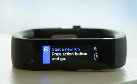
Before this study, when you opened the Run feature on the Band, it simply told you to “start a run.”
The team changed the UI to say “Press action button and go.”
And during the first-run experience, the setup steps taught you which button was the action button.
This was among the first of an iterative series of usability evaluations where I used the same or similar sets of user tasks to evaluate the experience and gauge improvements over time. In future usability tests after the change, everyone was able to track a run as intended.

My Role
Collaborate with designers to decide on what research questions we wanted to answer, then plan the research, request participants that represented our end users, execute the study sessions, analyze the data, write the report, communicate the findings to the team, and ensure it gets fixed.
Bonus research!
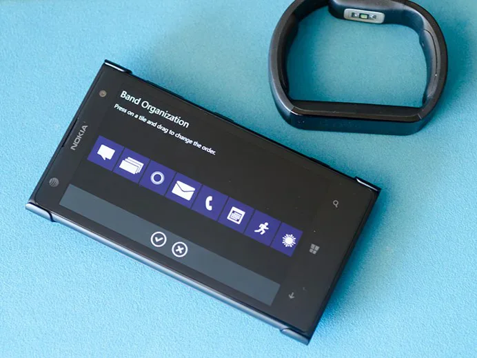
The designers wanted users to be able to rearrange the order of the tiles on the Band, and users wanted that feature as well.
In a different usability study, I evaluated two prototypes to see if one was easier to use.
I can’t show you the other version because it didn’t ship, but imagine something a bit more list-based. The one you see here is what shipped – users could manipulate the tiles directly by dragging them to the order they wanted.
Participants described it as both easier and more fun to use.
